
What’s the purpose of continuous accessibility testing? Not everyone clicks. Some people tap, some listen, while others rely on a keyboard to access your website like it’s second nature.
A step-by-step accessibility testing guide provides you with the best solution to make your content accessible to individuals with disabilities.
The goal is simple. We are building a web experience that works for every user. In this guide, we explain the step-by-step accessibility testing process and a few other tips to benefit your website and the users who access it.
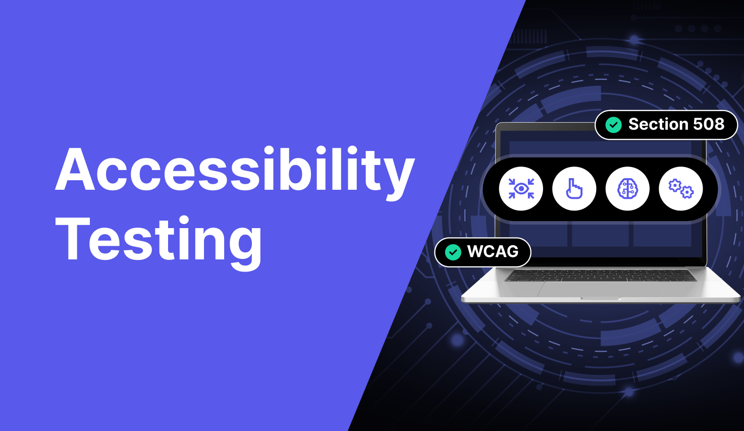
What Is Website Accessibility Testing?
Website accessibility testing makes sure everyone can use your website no matter their ability. That includes people who use screen readers, navigate with a keyboard, or rely on voice commands. Think of it as checking if your digital door is open for all.
You’re looking for anything that might block someone from using your site. Tiny things like missing image text or hard-to-read buttons make a big difference.
Testing spots those issues early. It also shows you how to test website accessibility the right way before someone else points out the problem.
The gold standard is WCAG (Web Content Accessibility Guidelines). If you follow that, you’re on the right track. This isn’t just about avoiding fines (though that’s smart too). It focuses more on design, better user experience, and, yes, better SEO.
When your website works for everyone, everybody wins.
What It Involves
So, what does accessibility testing actually involve? It’s not just one test; it’s a full checkup.
You’re testing for real people with real needs. That includes users who can’t use a mouse, rely on screen readers, or have color blindness.
A good website accessibility scan guide checks how your site works across devices, browsers, and assistive tools. It makes sure users can read, click, scroll, and fill out forms with no problem.
Here’s the short list of what gets tested:
- Screen reader compatibility
- Keyboard navigation
- Alt text for images
- Color contrast
- Forms and buttons
- Captions and transcripts
Step-by-step accessibility testing means walking through the site like someone with a different ability would.
You simulate real use cases instead of just running a scanner and calling it a day. And yes, tools help. But pairing tools with hands-on testing gives you the full picture. It’s all about asking: Can everyone actually use this?
Who Should Test Accessibility?
Website accessibility is a team sport. Everyone involved in building and maintaining a digital product should take part in step-by-step accessibility testing.
Developers are on the front lines. They implement code that works with assistive technologies and fixes technical barriers like missing labels or keyboard traps.
Designers play a big role, too. They choose color schemes, layouts, and interactions that either help or hinder users with disabilities. If a design doesn’t meet contrast ratios or relies only on color to communicate something, it’s already inaccessible before the code is written.
Quality assurance (QA) testers should include accessibility checks in every release cycle, not just once a year. They’re responsible for catching issues early when they’re cheaper and easier to fix.
Product teams and managers also need to care. They set the priorities. If accessibility isn’t on the roadmap, it won’t happen.
So, when should testing happen? Early and often. Start during design. Check again during development. And always re-test after changes. Accessibility Is an ongoing process. Think of it like performance or security: essential, repeatable, and everyone’s job.
A well-built product is usable by everyone. That’s what true accessibility means for every digital space.
Step-By-Step Accessibility Testing Guide
Here’s our detailed guide for accessibility testing.
1. Know What You’re Testing Before You Start Clicking Around
Before you proceed with any sort of accessibility testing for your website, you should figure out what you’re working on. It’s like having a mind map before you start working on a project.
You should ask yourself a couple of questions, such as: Am I testing a public-facing website, an internal dashboard, or that dusty microsite?
This is important because your colleague in marketing might be more concerned with clean headings and readable CTAs, while your dev team worries about keyboard navigation. That’s why becoming familiar with what you’re testing is the first and most overlooked part of the process.
Start by defining the scope: which pages or components are you testing? Then, decide your goal. Most teams aim for WCAG 2.1 Level AA.
When you’re learning how to test website accessibility, knowing your scope helps everyone. This step will lay out the foundation for the rest of your step-by-step accessibility testing plan. Every user that visits your site will find things more easy to use and accessible.
2. Let the Bots Do the Boring Bit
Automated tools are quite a time saver in this job. You must’ve come across testing tools such as Accessibility Spark, WAVE, DevTools, and Lighthouse. With these under your belt, you can quickly fix things such as missing alt text, incorrect heading structure, poor color contrast, and even ARIA misuse. Once these are fixed, half of your job is done. They’re quite a reliable set of tools for identifying repeatable problems that exist across almost every page.
However, automation only covers about 30% of accessibility barriers. For example, it won’t tell you if the alternative text is meaningful or if screen reader navigation is logical.
We recommend using these scans as a starting point. Entirely relying on them and skipping hands-on testing could land you in hot water, especially considering the higher number of ADA lawsuits filed against organizations for poor accessibility.
Some of these automated tools provide reports that let developers take quick action to fix problems that pop up. However, relying entirely on them could make you miss out on many issues experienced by users. You can let the bots do the boring bit first and then follow up with manual testing so there are fewer errors to correct.
3. Conduct Manual Testing: Click, Tab, and Listen
Manual testing is where real issues pop up. This step is of utmost importance because it’s the most user-centric step you’re taking when it comes to accessibility testing. You need to check your website for keyboard navigation. Here’s what to do,
- Check if you’re able to access every button, form, and menu without a mouse.
- Use the tab key to move across interactive elements.
- Make sure focus indicators are visible, skip links work, and pop-ups don’t trap users.
After that, test your site with screen readers like NVDA (Windows), JAWS (paid, enterprise-level), or VoiceOver (Mac).
Turn off your monitor and rely only on the reader to guide you. Test page landmarks, heading levels, form labels, and image descriptions. Make sure the tab order is logical and consistent.
Don’t forget modal windows. Ensure that the keyboard focus stays inside the modal until it’s closed. Skip links should jump users past repetitive headers directly to the main content. Try zooming in to 300% to see how content reflows.
Your aim is to catch issues that automation misses. This includes vague links like “click here” or poor alt text that doesn’t help users or hidden traps that frustrate users and make them abandon a site.
Your goal is to combine automated testing with manual testing in this step-by-step accessibility testing process.
4. Check Color Contrast & Visuals
Ever tried reading gray text on a pale yellow background? Yeah, don’t do that. Color contrast is a big deal, especially for those individuals who have vision disabilities like low vision or color blindness.
Start with tools like the Colour Contrast Analyzer (CCA) and check if your text meets the WCAG contrast ratios: 4.5:1 for regular text and 3:1 for large text.
It’s not just about paragraphs, either. Look at your buttons, links, hover states, and even that slick call-to-action banner your designer loves. If the text blends into the background, people won’t read it, let alone click it.
If your brand colors are causing problems, don’t panic. Just outline the text, adjust brightness, or add a subtle background block. Make your visuals speak clearly. This step is the core of your website accessibility scan guide.
5. Forms: Fix the Digital Paperwork
Forms should be easy to fill, not a guessing game. First, label everything if a user can’t tell what to put where that’s a problem. Use <label> tags properly, and when needed, add ARIA attributes but gently. Don’t overload them.
Next, test it like someone who’s never seen it before. Try tabbing through each field.
Is the order logical? Does focus land where it should? Now, mess up on purpose. Skip a required field. Did you get a clear error message that tells you what to fix and where? Did your screen reader friend hear the same message?
Your form should be easy to complete whether you’re using a keyboard, a screen reader, or just having a really rough Monday. Step-by-step accessibility testing means putting yourself in your user’s shoes and helping them succeed.
6. Content Structure: Headings Are Not a Mood
If your page is just bold text and hope, we’ve got a problem. Proper structure isn’t just about SEO. It’s how users (and screen readers) make sense of your site. Use <h1> for your main title, <h2> for sections, and so on. Don’t jump from <h2> to <h4> like it’s a choose-your-own-adventure.
Also, use proper landmarks like <main>, <nav>, or ARIA roles to organize your layout. This benefits those who use your website with a screen reader. Forget about the developer’s perspective for a moment here.
You need to understand this from a user’s point of view. If your layout is a maze, people will just leave. Make this all about clarity. Your content should be easy to scan, easy to read, and structured in a way that makes sense at a glance.
7. Real Users, Real Feedback: The Final Boss
No matter how many tools or simulations you run, nothing beats talking to real people.
Recruit users with disabilities to test your website using their actual devices and tools, including screen readers, switch controls, and voice navigation. Their lived experience shows you what automated tests and even manual audits might miss.
You can simulate some of this (and you should), but it’s not the same. A screen reader might tell you your alt text is present, but a blind user can tell you if it’s helpful.
This step turns your website from “technically compliant” to “actually usable.” And if you’re serious about learning how to test website accessibility, this is where it becomes a community effort instead of being a mere checklist.
Ongoing Monitoring and Maintenance
Accessibility isn’t set-and-forget. You must treat it as an ongoing commitment. Your website, content, and everything in the digital space evolves with time. Therefore, you should make accessibility testing a regular practice. When you add pages, update codes, swap themes, or run campaigns, always run a quick test.
Every change is a chance to break something. That’s why scheduled re-testing is a must. Whether it’s every quarter or after big releases, regular audits keep your site in check.
You should also inculcate this into your team culture. Train your designers, developers, and markets. Anyone who contributes to your site must become familiar with a thorough step-by-step procedure to check accessibility issues. When everyone knows what to look for, fewer issues slip through the cracks.
Seems like a tough job? Tools like Accessibility Spark can speed up the process for you. This tool doesn’t just scan and point fingers. Instead, it focuses on explaining the issues so you and your team can fix them quickly. It also auto-fixes minor accessibility issues and makes your work easy. All you have to do is run a quick scan.
Wrapping Up
A good website accessibility scan guide helps you catch the sneaky stuff like broken tab flows, missing labels, and color contrast failures you didn’t notice until someone pointed them out.
If you’re tired of juggling five tools and 20 tabs, rely on Accessibility Spark, which makes your life easier. It bundles audits, visual reports, and fixes into one space that actually makes sense whether you’re in dev, design, or QA.
Never run a one-time test and pat yourself on the back. Keep checking, keep fixing, and keep thinking about the people on the other side of the screen. That’s how we build better web experiences for everyone.