
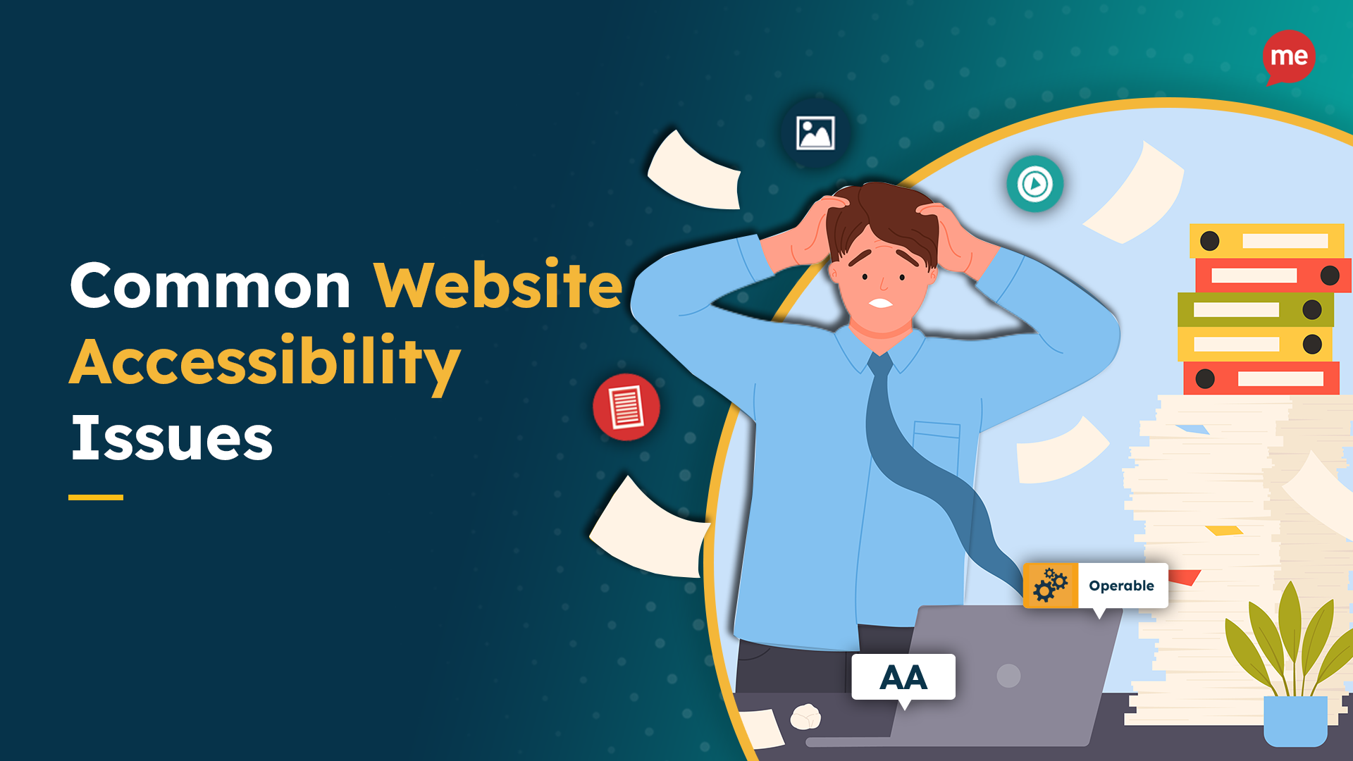
If your website were a city, would everyone be able to find their way, or would half your population get lost at the first street sign? Accessibility is the map most websites forget to draw, and millions of users are left wandering.
When digital spaces don’t work for everyone, they don’t really work at all. From unreadable text and missing labels to navigation traps and silent videos, the most common accessibility issues are often the simplest to fix.
In this guide, we’ll show you how to fix accessibility errors that quietly cost you trust, traffic, and compliance. We focus on one practical, user-first solution at a time.
Why Accessibility Isn’t Just a Checkbox
Picture shopping from a store where you can’t access the aisles or grab anything from the top shelves, and there’s no one around to help. In this case, the chances are very high that you’d turn around and leave.
Now, imagine someone facing that same frustration online. That’s exactly what a website without accessibility feels like for users with disabilities.
Digital spaces are places through which people access the bank, apply for jobs, book appointments, and learn. So, if your site is difficult to use for someone relying on a screen reader or impossible to use without a mouse, millions of potential users find your content inaccessible.
Accessibility doesn’t just help a niche group; it helps everyone. Older users, people with slower internet, someone browsing one-handed while holding a baby — these are all real-world cases where accessibility features make the experience better.
And let’s talk numbers. Roughly 1 in 6 people worldwide have a disability. That’s a huge audience you risk losing if your website puts up barriers.
More than just ticking off legal boxes, accessible websites reflect inclusive values. They show your users that you care. And in return, they’re more likely to stick around, recommend your brand, and trust what you build.
Broken Links, Bad Labels & Other Things That Drive Users Away
You simply have to surf your website to better understand the user’s perspective. When basic things such as browsing your website from a keyboard-only setup present problems, it means that your site isn’t as accessible as you thought.
Maybe the text fades into the background. Maybe clicking “Learn more” leaves you more confused. Or maybe you’re just trying to fill out a form, but nothing makes sense. These are common accessibility issues that frustrate users and quietly drive them away.
Let’s break down some real-world web accessibility error examples you might recognize:
- Missing or unclear image alt text
- Bad contrast between the text and background
- Inconsistent heading levels
- Confusing or repetitive navigation menus
- Form fields without labels
- “Click here” links with no context
- Documents that screen readers can’t access
- Videos with no captions
- Poor mobile usability
- Keyboard traps that block navigation
Are you noticing a pattern now? These are everyday problems that people face when they use a website. You’ll need to fix accessibility errors to make your site work for everyone, not just the lucky few.
How To Fix Common Accessibility Issues on Your Website
When websites don’t work the way users expect, they leave. It’s that simple. The good news? Most accessibility barriers aren’t complex to fix because they’re just simple factors that are commonly overlooked.
Some of the most overlooked web accessibility error examples include missing image descriptions, jumbled form fields, and color choices that look great on a poster but are unreadable online. These mistakes creep into even the most well-designed websites.
According to the WebAIM Million study, nearly every homepage (96.3%) had detectable WCAG 2 failures in 2023. That means even if your site looks polished, there’s a good chance something’s broken beneath the surface. But don’t worry. You don’t need to be a WCAG expert to make progress.
Let’s break down some of the most common accessibility issues one by one and walk through how to fix them with confidence (and maybe even style). These are small changes that make a massive difference to real users.
1. Fix That Alt Text First
Alt text does more than just improve SEO. It narrates your visuals for users who can’t see them. When images don’t have alt descriptions, people using screen readers are left out of the conversation. And this isn’t a rare issue.
According to WebAIM’s 2021 analysis, over 60% of homepages had at least one image missing alt text, and half of those images were also links, leaving users guessing where those links go. That’s a major accessibility breakdown.
Adding alt text is one of the fastest ways to fix accessibility errors and boost usability across the board. There is something to keep in mind here, though. Poorly written or irrelevant alt text can be just as unhelpful as none at all.
For better alt text, you should write clear, concise descriptions that tell users what the image conveys. Focus on purpose, not pixels. If the image is functional (like a button or linked icon), describe the action it performs. For example, “Download report” instead of “PDF icon.”
Here are a few ways to properly implement alt text based on your image setup.
- Keep it short
- Focus on function
- Skip the obvious
- Don’t duplicate nearby text.
- For standard images: Use the alt=”” attribute for decorative content, or add helpful, human-readable alt text for informative ones.
- For background images or custom elements: Consider using ARIA attributes like aria-label or aria-labeled to describe the image’s intent.
- For interactive graphics or complex visuals: Add a description nearby in the text or use a <figcaption> if appropriate.
Done right, alt text not only supports screen reader users but also makes your content more discoverable, structured, and complete. That’s how you fix accessibility errors and improve UX in one go.
2. Contrast Isn’t Just a Design Trend
You might think your pastel text on a soft beige background looks sleek, but to someone with low vision or color blindness, it might look like a blank page.
Poor contrast is one of the most common accessibility issues on the web, and yet it’s often brushed off in the name of “aesthetics.”
Here’s the thing: contrast is about readability. Users should be able to read what you’ve written. If users have to squint, zoom in, or highlight text just to read it, your website isn’t working as it should.
Here’s how to fix website accessibility issues.
- Use a contrast checker to test how your text and background colors stack up.
- For regular-sized text, aim for a contrast ratio of at least 4.5:1
- For large text (14pt bold or 18pt normal), 3:1 is acceptable
If your theme colors don’t pass, try darkening the text or lightening the background or vice versa. Add outlines or text shadows if needed. And don’t forget buttons, links, and placeholder text. These often fail even when the rest looks fine.
Not sure where to start? Accessibility Spark includes built-in contrast analysis tools that flag problem areas for you. You’ll get clear visuals, WCAG guidelines, and actionable fixes without needing to decode any technical jargon. It’s perfect for teams that want results without the headache.
3. Headings Aren’t Just for SEO
Let’s clear this up: headings aren’t just there to impress Google. They’re how users and screen readers make sense of your content.
When you jump from <h1> straight to <h4>, sure, your page might look the way you want visually, but for someone using assistive tech, it’s like skipping chapters in a book and wondering why nothing makes sense. The heading structure becomes a roadmap, and if that map’s full of gaps, users get lost fast.
In fact, inconsistent or missing headings are among the most common accessibility issues reported in audits. This messes with everyone, not just people using screen readers but also keyboard-only users, people scanning quickly, or anyone with cognitive fatigue.
Fix accessibility errors like this with a simple plan:
- Start with one <h1> per page. This is your title.
- Use <h2> for major sections
- Nest deeper with <h3>, <h4>, and so on only as needed
- Don’t skip levels (no jumping from <h2> to <h5>)
- Stop using headings to make text bigger. That’s what CSS is for.
Tools like Accessibility Spark can help you spot heading hierarchy issues instantly. It visually maps out your page structure and flags where things go out of order. No more second-guessing your code; just a clear view of where things went sideways.
4. Labels and Forms That Don’t Confuse People
You know that feeling when you’re staring at a form field, thinking, “Wait..what do they want me to type here?” That confusion hits harder for people using assistive tech. And yet, over half of websites still forget to add proper labels to their forms. That’s like handing someone a quiz with no questions on it.
If a field doesn’t have a proper label, screen readers just announce it as “edit blank.” Doesn’t sound very helpful, does it?
Using just a placeholder? That disappears the second someone types, leaving no context. Plus, if there’s an error, the message might show up, but is it even linked to the field? Often, no.
Here’s how to fix website accessibility issues like this the smart way.
- Wrap every input with a proper <label> tag
- If the visual layout is tricky, use aria-label or aria-labelledby.
- Link error messages using aria-describedby so they’re read with the field
- Make sure form instructions stay visible when someone starts typing
- Use logical tab order so the form flows naturally
5. Links Should Say What They Do
Imagine your friend hands you a list of five buttons, all labeled “click here.” You’d probably look at them and ask, “Click where exactly?” That’s exactly how screen reader users experience unclear links on websites.
Without context, they’re left guessing what each one does, and most won’t stick around to find out. Unfortunately, this is still one of the most common accessibility issues on the web.
Many sites rely on vague labels like “here” “more,” or use icons without any accompanying text. These don’t translate well when you can’t see the screen, and in some cases, they don’t translate at all. That’s not just bad UX. It’s been the subject of real legal action.
How to fix such accessibility errors:
- Use link text that describes the destination or action.
- Avoid using just icons or font glyphs. Add visually hidden labels with aria-label or screen-reader-only text
- Test with a keyboard and screen reader: Can you Tab to the link? Does it say what it does?
- If you’re repeating links across a page, give them unique names or destinations. Don’t make users guess.
6. Clean Up the Keyboard Navigation
If you’ve ever hit the Tab key and gotten lost or stuck, you know how frustrating poor keyboard support can be. Users with motor disabilities or assistive tech rely on keyboard navigation, yet it’s often broken. No visible focus? That’s a red flag.
How to fix this:
Use your site with just a keyboard. Can you reach every button, link, or form? Are focus outlines visible? Avoid “keyboard traps” where users can’t escape modals. Add skip links so users can jump past repetitive menus.
7. Bonus Round: Don’t Forget Mobile and Videos
Accessibility doesn’t end with desktops. Videos without captions exclude deaf users. Mobile layouts that break on zoom block low-vision users. Many websites also host PDFs or documents that are unreadable by assistive tech.
You can fix this by adding accurate captions and transcripts to all video content. Use a responsive design that supports zooming without breaking the layout. And make sure embedded documents are tagged and structured for screen readers or offer HTML alternatives.
Resolve Accessibility Issues with Accessibility Spark
Making your website accessible doesn’t have to be complicated, but it does need to be consistent. With Accessibility Spark, you go beyond a checklist to solve problems users face every day.
You get a powerful tool that actively scans, fixes, and monitors your site for compliance with ADA and WCAG standards. From image alt text to keyboard traps and everything in between, Accessibility Spark helps you resolve accessibility issues faster and smarter.
Whether you’re adding new products, updating forms, or embedding videos, our automatic daily scans make sure nothing slips through. Install the app, enable the interface, and start building a better web for everyone.