
In data visualization, accessibility is paramount to ensure everyone, including individuals with disabilities, understands and usable information. Accessible pie charts make data more inclusive, allowing all users to grasp insights effortlessly.
This article focuses on creating accessible pie charts, guiding you through the essential steps and best practices to design, implement, and maintain charts that adhere to accessibility standards.
By following this guide, you can enhance your data presentations, ensuring they are both effective and inclusive for a diverse audience.
What Is an Accessible Pie Chart?
Creating accessible pie charts ensures that your data is understandable and usable by everyone, including individuals with disabilities. By leveraging web accessibility tools, you can design pie charts that meet accessibility standards and provide an inclusive experience for all users.
Definition and Importance
An accessible pie chart is more than just a colorful display of data slices—it’s a gateway to understanding for everyone, including people with disabilities.
So, what makes a pie chart accessible? It’s all about designing charts that everyone can read and interpret, regardless of their abilities. This means using clear labels, high-contrast colors, and text alternatives that screen readers can pick up.
By doing this, you’re making your data visualization more inclusive and enhancing the overall user experience. With the right web accessibility tools, creating an accessible pie chart is a breeze!
Accessibility Standards
Regarding accessibility, we can’t ignore the big players: the ADA (Americans with Disabilities Act) and WCAG (Web Content Accessibility Guidelines). These standards are your best friends in ensuring your pie charts are up to snuff.
The ADA mandates that all digital content be accessible to people with disabilities, while WCAG provides detailed guidelines to help you achieve this.
For example, WCAG advises using sufficient color contrast and providing text alternatives for all visual content. By following these standards, you can create accessible pie charts that comply with legal requirements and offer a better experience for all users.
The Use of Accessible Pie Charts
Imagine your data as a delicious pie that everyone wants a slice of. Accessible pie charts make sure everyone gets their fair share of information, regardless of their abilities.
Using web accessibility tools like color contrast checkers and accessibility checkers, you can whip up charts that are as inclusive as they are informative.
Benefits in Business
Businesses thrive on data, and accessible pie charts ensure data reaches everyone. By incorporating accessible pie charts, businesses can tap into a wider audience, including people with disabilities.
This promotes inclusivity and boosts your brand’s image as a forward-thinking, socially responsible entity. Moreover, accessible charts can improve decision-making processes by providing clear, understandable data to all stakeholders.
User Experience Improvement
Accessible pie charts are a game-changer that enhances user experience. They make it easier for people with disabilities to understand and interact with data.
For instance, a color contrast checker ensures that all text and visuals are easily readable, while an accessibility checker helps identify and fix potential barriers. These tools collectively ensure that your pie charts are visually appealing and functional for everyone.
Educational Uses
Accessible pie charts are invaluable in educational settings. They help students of all abilities grasp complex data more easily. By making use of web accessibility tools, educators can create charts that are clear and understandable, aiding in better learning outcomes for all students.
Government and Public Sector Applications
In the public sector, accessible pie charts are crucial in ensuring transparency and inclusivity. Government websites can use these charts to present data in a way that’s accessible to all citizens, ensuring that everyone has equal access to important information.
Enhancing Communication in Teams
Within organizations, accessible pie charts can enhance internal communication. They ensure team members with disabilities can fully participate in data-driven discussions and decision-making processes. By using accessible charts, teams can work cohesively and make informed decisions that benefit the entire organization.
A Step-by-step guide for Inclusive Data Visualization
By following the steps, you can create accessible pie charts that ensure all users can understand and interact with your data, regardless of their abilities.
Utilizing web accessibility tools and adhering to best practices will help you design inclusive and effective charts.
Creating an accessible pie chart involves several critical steps to ensure that your data is inclusive and user-friendly. Let’s dive into a detailed guide to help you make your pie charts accessible for everyone, regardless of their abilities.
Step 1: Choosing the Right Tool
The first step in creating an accessible pie chart is choosing the right tool. There are several web accessibility tools available that support the creation of accessible charts, such as Google Charts, Highcharts, and Tableau. These tools offer features that help in designing charts that meet accessibility standards.
When selecting a tool, consider its ease of use, customization options, and built-in accessibility features. Look for tools that provide color contrast and accessibility checkers to ensure your charts are accessible.
Step 2: Designing the Pie Chart
Designing an accessible pie chart requires attention to several key elements.
Color Contrast
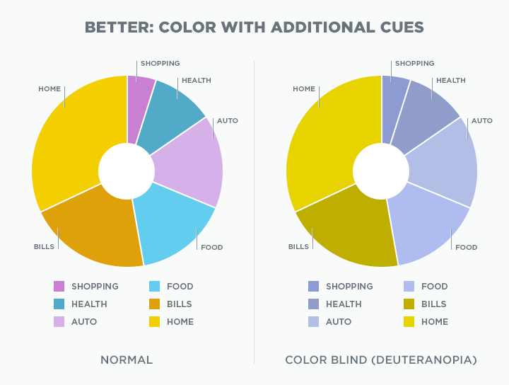
Ensuring sufficient color contrast between pie segments is essential for readability and accessibility. Users with visual impairments, such as color blindness, rely on high contrast to distinguish between different segments.
Using a color contrast checker helps you select colors that are easily distinguishable. The contrast ratio should meet the WCAG guidelines, which recommend a minimum contrast ratio of 4.5:1 for normal text and 3:1 for large text.
Choosing the right colors makes your pie chart more inclusive and easier to understand for all users, regardless of their visual abilities.
Labeling
Adding clear, descriptive labels to each pie chart segment is crucial for effective communication. Labels should be concise yet informative, providing immediate context for each data point. This helps all users, including those with cognitive disabilities, quickly understand the presented data.
Use straightforward language and avoid jargon to ensure clarity. Position labels directly on or near the corresponding segments to minimize confusion. Clear labeling enhances readability and ensures that your chart is accessible to a wider audience, improving overall comprehension.
Text Alternatives
Providing text descriptions for screen readers is another vital step in designing accessible pie charts. These text alternatives should convey the same information as the visual chart, allowing users with visual impairments to understand the data through their assistive technology.
Include detailed descriptions of each segment, explaining what each part of the chart represents. Use ARIA (Accessible Rich Internet Applications) attributes to enhance the accessibility of your text descriptions.
By offering comprehensive text alternatives, you ensure that your pie chart is fully accessible, enabling all users to benefit from the information it presents.
Step 3: Implementing Interactive Features
Interactive features can significantly enhance the accessibility of your pie charts.
Keyboard Navigation
Ensuring that users who cannot use a mouse can still interact with your charts is crucial for accessibility. This involves ensuring all interactive elements, such as data points and tooltips, are accessible via the keyboard.
Providing clear focus indicators helps users navigate through the chart using keyboard inputs, enhancing usability for individuals with motor disabilities.
Ensure that every interactive element can be accessed and activated through keyboard shortcuts, and test thoroughly to guarantee smooth navigation. This attention to detail ensures that your pie charts are inclusive and functional for a wider range of users.
Screen Reader Compatibility
Ensuring compatibility with screen readers is essential for users with visual impairments. This means providing appropriate ARIA (Accessible Rich Internet Applications) labels and roles to make interactive elements comprehensible to screen readers.
Use ARIA attributes to describe the purpose and state of interactive elements clearly, enabling screen readers to convey this information accurately to users.
Additionally, ensure that all dynamic updates are announced to screen readers without disrupting the user’s current activity. Focusing on screen reader compatibility makes your pie charts accessible to users who rely on these technologies to interpret digital content.
Step 4: Testing Accessibility
Testing is a crucial phase in creating an accessible pie chart. It ensures that your chart meets all necessary accessibility standards and is usable by everyone.
Automated Testing Tools
Use automated testing tools like WAVE, Axe, and Accessibility Spark to check for common accessibility issues. These tools can quickly identify problems such as insufficient color contrast, missing labels, and improper ARIA attributes.
Automated tools provide detailed reports and suggestions for improvements, making it easier to address accessibility barriers efficiently. By incorporating these tools into your testing process, you can ensure that your pie charts are designed to be accessible from the outset, saving time and effort in the long run.
Manual Testing
In addition to automated tests, users with disabilities are involved in manual testing. Their feedback can uncover issues that automated tools might miss and provide valuable insights into the real-world usability of your charts.
This hands-on approach ensures that your pie charts are not only technically accessible but also practically usable for people with various disabilities. Engaging with actual users helps to identify and address specific challenges they may face, leading to more inclusive and effective data visualizations.
Step 5: Continuous Monitoring and Updating
Accessibility is not a one-time task; it requires ongoing effort.
Regular Audits
Conduct regular audits to maintain compliance with accessibility standards. This includes re-checking color contrast, labels, and interactive features as you update or add new content to your pie charts.
User Feedback
Incorporate feedback from users to continuously improve the accessibility of your pie charts. Encourage users to report difficulties and use this feedback to make necessary adjustments.
Tools That Help With Inclusive Data Visualization
Creating accessible pie charts is a matter of best practices and using the right tools. Various chart tools, accessibility testing tools, and assistive technologies are pivotal in ensuring your data visualizations are inclusive and compliant with accessibility standards. Let’s explore these tools in detail.
Chart Tools
When it comes to crafting accessible pie charts, selecting the right chart tool is essential. These tools offer a range of features designed to help you create visually appealing and inclusive charts. They allow for customization and include built-in accessibility options to ensure your data visualizations are accessible to everyone.
Google Charts
Google Charts is a versatile and powerful tool that offers a variety of chart types, including pie charts. It comes with built-in accessibility features designed to make your charts more inclusive.
Google Charts supports keyboard navigation, essential for users who rely on keyboards rather than mice. It also includes ARIA labels, which improve the chart’s compatibility with screen readers.
Furthermore, Google Charts provides customization options for colors and labels, allowing you to ensure sufficient color contrast and clear, descriptive labeling, which are crucial for accessibility.
Highcharts
Highcharts is another robust tool that supports accessible data visualization. It offers a suite of features aimed at enhancing the accessibility of your charts.
Highcharts provides a module specifically for accessibility, which includes support for keyboard navigation and screen readers.
The tool also allows you to customize colors to ensure adequate contrast and add text alternatives for visual elements. Highcharts’ accessibility module adheres to WCAG guidelines, making it easier to create charts that comply with global accessibility standards.
Accessibility Testing Tools
Even with the best design practices, it’s crucial to test your pie charts for accessibility. Accessibility testing tools help identify and fix potential issues, ensuring that your charts meet all necessary standards and are usable by everyone. These tools can automate testing, providing detailed reports and improvement suggestions.
Accessibility Spark
Accessibility Spark is a comprehensive solution designed to simplify web accessibility for businesses. Installing the Shopify application gives you access to a powerful accessibility interface that scans and analyzes your website.
Within 48 hours, all accessibility issues are identified and adjusted according to ADA and WCAG standards. Accessibility Spark conducts automatic daily scans to ensure constant compliance for new or added content, forms, images, videos, or widgets.
The tool can appear as an overlay on your website or be activated via a screen reader for users who are blind. Additionally, users with different disabilities can select the web profile that best suits their needs.
The interface is fully customizable, allowing it to adapt to your website design, including icons, sizes, shapes, and colors. By using Accessibility Spark, you can effortlessly maintain a high standard of accessibility.
WAVE
WAVE (Web Accessibility Evaluation Tool) is a widely used tool for testing the accessibility of web content, including pie charts.
WAVE visually represents accessibility issues by highlighting them directly on the web page. This makes it easy to identify and fix problems.
The tool checks for various accessibility criteria, such as color contrast, missing labels, and improper use of ARIA attributes. By using WAVE, you can ensure that your pie charts are accessible and meet the required standards.
Axe
Axe is another powerful accessibility testing tool that integrates seamlessly into your development workflow. It offers comprehensive analysis and reporting of accessibility issues, making it a favorite among developers.
Axe can be used to test the accessibility of your pie charts by identifying issues like insufficient color contrast, missing text alternatives, and keyboard navigation problems. With Axe, you can ensure that your charts are visually appealing and accessible to all users.
Assistive Technologies
Assistive technologies are critical in making digital content accessible to users with disabilities.
These technologies include tools like screen readers and Braille displays, which convert visual data into speech or tactile formats that can be used by individuals with visual impairments.
By ensuring compatibility with these technologies, you can make your pie charts accessible to a broader audience, enhancing inclusivity and usability.
Screen Readers
Screen readers are essential assistive technologies that convert text and other visual information on a screen into speech or Braille. Popular screen readers include JAWS (Job Access With Speech), NVDA (NonVisual Desktop Access), and VoiceOver (for macOS and iOS).
These tools interact with pie charts by reading the labels and data values, providing context and understanding for visually impaired users.
Ensuring that your pie charts are compatible with screen readers involves using ARIA labels and providing text alternatives that convey the same information as the visual elements.
Braille Displays
Braille displays are devices that convert text on a screen into Braille, allowing blind users to read through touch.
Making pie charts accessible for Braille displays involves providing detailed text descriptions of the chart’s data. This can be achieved by including summary descriptions that capture the key points and insights of the chart.
For example, if a pie chart shows market share data, the text description should detail each segment’s percentages and relevant context. Doing so ensures that all users, regardless of their ability to see, can access and understand the data presented in your pie charts.
Advanced Techniques for Accessible Data Visualization
Advanced techniques are essential to push the boundaries of accessible data visualization. These techniques not only ensure compliance with accessibility standards but also enhance the user experience by providing dynamic and interactive features. Implementing these methods can help you create more engaging and inclusive data visualizations.
Dynamic Updates
Dynamic updates in data visualization involve real-time data changes and interactive elements that keep the information current and engaging. Ensuring that these updates are accessible can be challenging but is crucial for maintaining inclusivity.
Real-Time Data
Ensuring accessibility in real-time data updates requires careful planning and implementation. Using ARIA live regions to announce updates to screen reader users without disrupting their current activities is important. Additionally, maintaining clear and consistent labeling helps users quickly understand new information as it appears.
Interactive Elements
Making interactive elements accessible involves enabling keyboard navigation and ensuring screen reader compatibility. Interactive features like tooltips, zoom functions, and clickable areas should be operable via keyboard shortcuts and properly labeled with ARIA attributes. This ensures that all users can fully engage with the data regardless of their abilities.
Data Simplification
Data simplification is crucial for making complex information more accessible. Simplifying data not only helps users with cognitive disabilities but also enhances overall comprehension for a wider audience.
Simplifying Complex Data
Techniques for breaking down complex data into accessible formats include:
- Using clear and concise labels.
- Avoid cluttered visuals.
- Breaking data into smaller, more digestible chunks.
Providing summaries or key takeaways can also help users quickly grasp the main points without getting overwhelmed by details.
Alternative Visuals
Using other types of charts for better accessibility is another effective strategy. While pie charts are useful, alternative visuals like bar charts, line graphs, or scatter plots might be more suitable for certain data sets. These alternatives can sometimes present information clearer and more straightforwardly, enhancing overall accessibility and understanding.
Common Pitfalls and How to Avoid Them in Creating Accessible Pie Charts
Creating accessible pie charts involves careful planning and attention to detail. However, there are common pitfalls that can undermine accessibility efforts.
Understanding these pitfalls and avoiding them is crucial for achieving truly inclusive data visualizations.
Design Flaws
Common design mistakes in pie charts can significantly impact their accessibility. One major flaw is the use of colors with insufficient contrast, making it difficult for users with visual impairments to distinguish between segments.
Another common mistake is overcrowding the chart with too many segments, making it confusing and hard to read. Additionally, failing to provide clear and concise labels can lead to misunderstandings about the presented data.
To avoid these design flaws, use a color contrast checker, limit the number of segments, and ensure all labels are easy to read and understand.
Accessibility Oversights
Accessibility oversights often occur when key accessibility features are neglected or improperly implemented. For instance, not providing text alternatives for visual elements can leave screen reader users without essential information.
Another common oversight is failing to make interactive elements of the keyboard navigable, which can exclude users who cannot use a mouse.
To address these issues, ensure that all visual information is also available as text, use ARIA labels for interactive elements, and conduct thorough testing with both automated tools and real users with disabilities.
By addressing these common accessibility oversights, you can create pie charts that are inclusive and usable for everyone.
Conclusion
Creating accessible pie charts ensures that all users can interact with and understand your data visualizations regardless of their abilities.
This guide has covered the importance of color contrast, clear labeling, text alternatives, interactive features, and the need for thorough testing using both automated tools and manual methods.
Accessible data visualization complies with legal standards and enhances everyone’s user experience. By implementing these accessible practices, you can create inclusive and effective pie charts that communicate your data clearly and effectively to a diverse audience.